By Carmel Schvartzman
In this tutorial we'll learn the Grid System of the Twitter Bootstrap. The Bootstrap includes a responsive grid system that scales up to 12 <div>s columns, and adapts itself to the device when size decreases.Bootstrap is the more widely used and more popular CSS3 framework for developing responsive web apps, making front-end web design very fast and easy.
In just 5 minutes we'll build a responsive web page using the Grid System of the Twitter Bootstrap with a form and a NavBar with no effort at all:

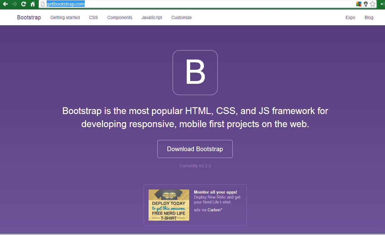
The Twitter Bootstrap can be reached & downloaded from the Bootstrap official site : Bootstrap :
We'll une the NuGet Manager to install the Bootstrap:
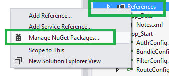
Search for "Bootstrap":

The manager will add CSS & JS files to your project :

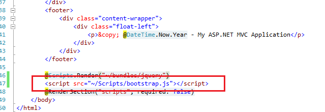
In order to use the Bootstrap in every web page, we'll modify the standard _Layout file at MVC Shared folder :

Having added both CSS and JS links, we modify the RouteConfig to browse to our test web page:

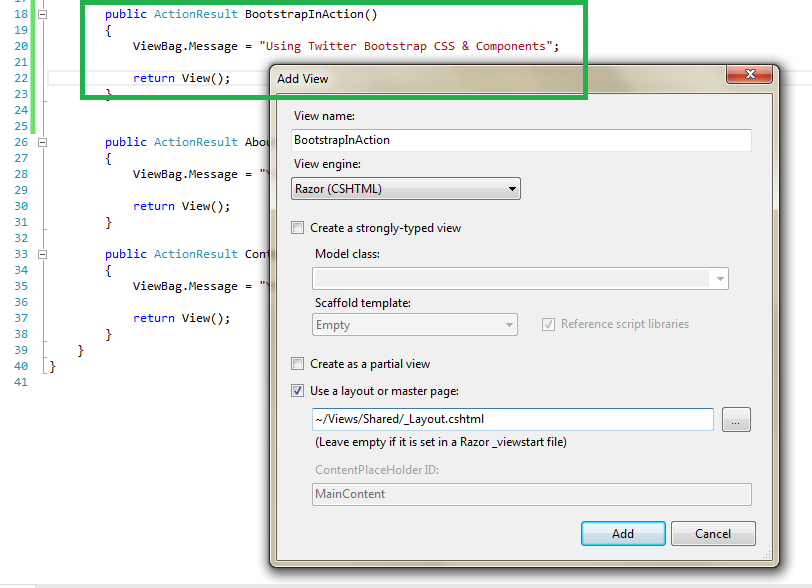
Now we add a new Action method & a View to test the Bootstrap :
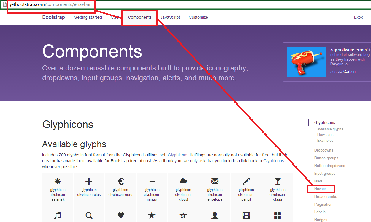
At the _Layout, we'll first add a NavBar, so go to the Bootstrap web site:
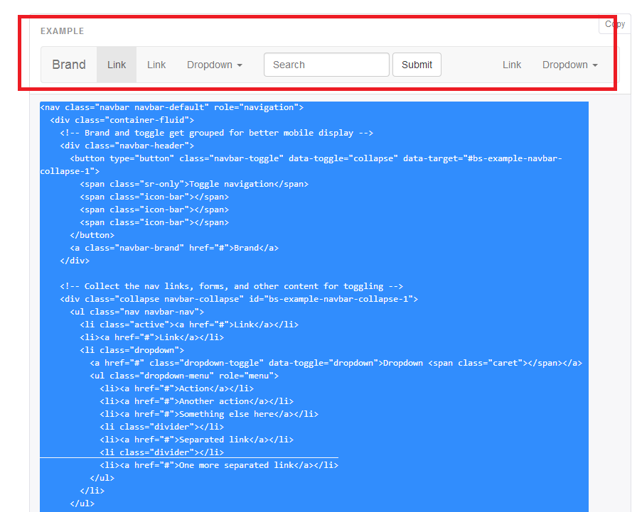
Copy the entire <nav>, & return to the _Layout file:
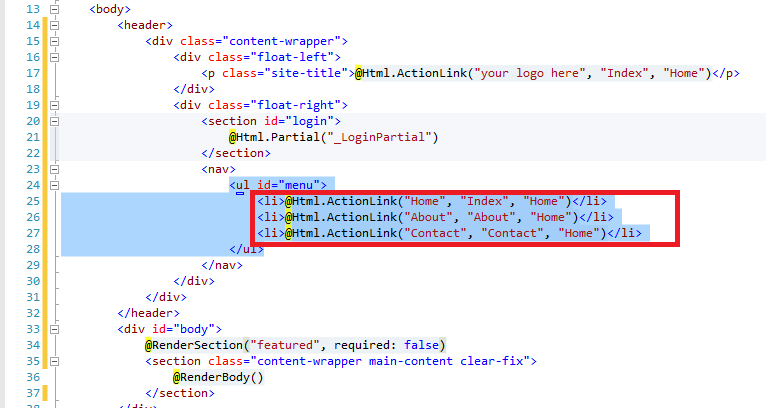
At the _Layout, take aside the Menu, because we'll use it afterwards:
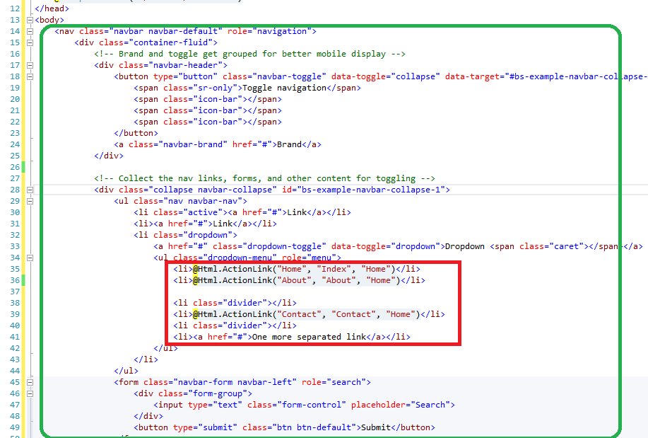
Then delete the whole <header> :

And paste the NavBar in place of that <Header>, updating the dropdown-menu with our Menu : :
Now find the "body" of the file:
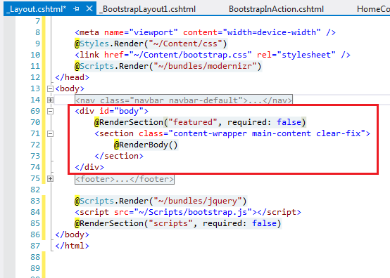
And replace the class for the "container" class :

Rebuild & browse to the web page :

We have already a NavBar. Now copy - paste the Grid System of the Bootstrap to your page, to have a wider idea of how the System works:


As you see, the class "col-md-X" tells Bootstrap how much columns you intend the div to spread. The Grid System divides the screen in 12 sections that looks like this:

After you paste the html inside your page, and replace the texts with some pictures, you can realize how the system works :

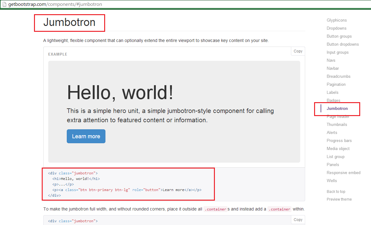
Just paste this code to your View:
<div class="jumbotron"> <h1>Hello, world!</h1> <p>...</p> <p><a class="btn btn-primary btn-lg" role="button">Learn more</a></p></div>
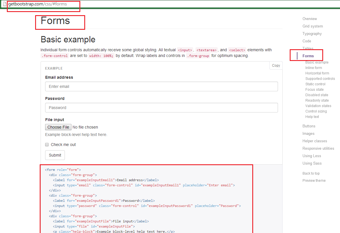
The complete HTML pasted inside the web page will be the following :
<div class="row"> <div class="col-md-6"> <form role="form"> <div class="form-group"> <label for="exampleInputEmail1">Email address</label> <input type="email" class="form-control" id="exampleInputEmail1" placeholder="Enter email"> </div> <div class="form-group"> <label for="exampleInputPassword1">Password</label> <input type="password" class="form-control" id="exampleInputPassword1" placeholder="Password"> </div> <div class="form-group"> <label for="exampleInputFile">File input</label> <input type="file" id="exampleInputFile"> </div> <div class="checkbox"> <label> <input type="checkbox"> Check me out </label> </div> <button type="submit" class="btn btn-default">Submit</button> </form> </div> <div class="col-md-6"> <div class="jumbotron"> <div class="container-flow"> <img class="img-circle" src="~/Images/Phalaenopsis_amboinensis.jpg" /> </div> <div class="container-flow"> <p><a class="btn btn-success btn-lg" href="http://getbootstrap.com/" role="button">Learn more at Bootstrap.com</a></p> </div> </div>
</div> </div>
And when you browse you can see the 6-6 division of the page as it results :

That's all!! In this tutorial we've learned the Grid System of the Twitter Bootstrap in Asp.Net MVC in 5 minutes.
Happy programming.....
כתב: כרמל שוורצמן
No comments:
Post a Comment