Here we describe Step by step How to create a jQueryMobile App using Grids For Android and BlackBerry
In this post we'll build together in 20 minutes a small jQuery Mobile HTML5 App using Grids for all kind of Mobile Devices : BlackBerry, Nexus , Acer , Nokia, iPad, iPhone, etc...The source code for this tutorial is located in this GitHub repository:
https://github.com/CarmelSoftware/jQueryMobile_Grids
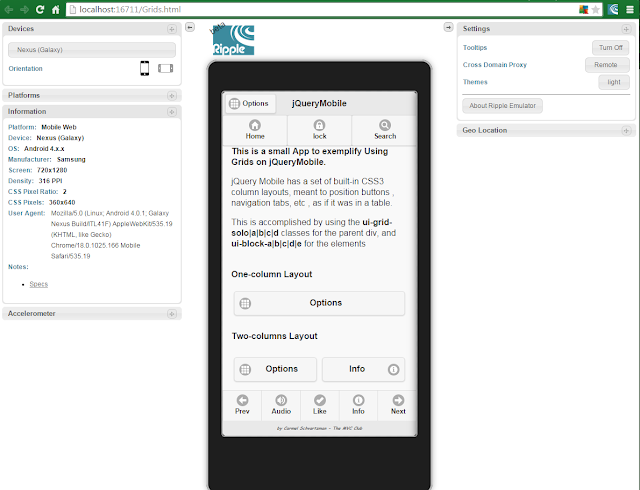
This small Mobile App looks like this:


jQueryMobile App using Grids For Android and BlackBerry
For this tutorial we will use the jQuery Mobile and jQuery Frameworks, so browse to http://jquerymobile.com/ and to jQuery official web site . Then copy the URLs of the latest versions of the files on CDN . We will also use a Mobile Emulator, so please refer to this 5 minutes tutorial on installing the Ripple Mobile Emulator.
After you obtain the frameworks URLs, add them to the HTML5 file:

Then, add a data-role="page" and a data-role="header" :

1) Grid with 100% Column Width:
jQuery Mobile has a set of built-in CSS3 column layouts, meant to position buttons , navigation tabs, etc , as if it was in a table.
This is accomplished by using the ui-grid-solo|a|b|c|d classes for the parent div,
and ui-block-a|b|c|d|e for the elements.

.content {
text-align:center;
font:900 30px Lucida Handwriting;
font-style:italic;
background:#F0FFFF;
color:#3399FF;
}
.footer {
font:700 8px Comic Sans MS;
}
.container {
text-align:center;
}
Happy programming.....
by Carmel Schvartzman
Inside the div that we wrote, that represents a Page of our jQueryMobile App , we insert another <div> in it , to be a Grid with only one compartment , using the class ui-grid-solo :

We use the jQuery Mobile class ui-block-a to define a column to the left inside the Grid.
Inside, we add a button , with Icon, shadow and round corners, using the correspondant jQuery Mobile classes.
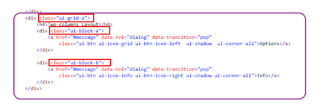
2) Grid with 50% - 50% Column Widths:
Now we create a Grid with two columns as follows :

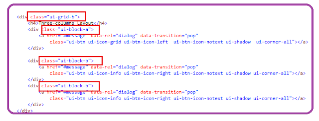
3) Grid with 33% - 33% - 33% Column Widths:
Next, we add another Grid , this time for three columns, which is done this way :

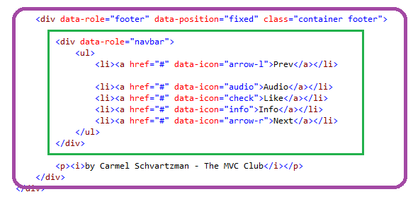
Finally, we append a Footer , in order to properly close this jQuery Mobile App, with a Navbar:

The complete list of Grid options can be found at the jQuery Mobile official web site.
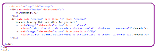
If you wish , you can also add a data-role="page" for the dialog that the buttons above open:

Now let's open the Ripple jQuery Mobile Emulator to see our App and to check it:

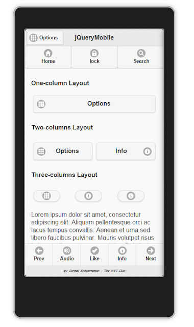
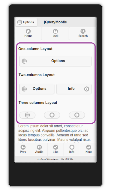
Here you see the One Column's Layout:
Here you see the Two Column's Layout and the Three Columns one:

We customized this App by adding some style in a CSS3 file as follows:
text-align:center;
font:900 30px Lucida Handwriting;
font-style:italic;
background:#F0FFFF;
color:#3399FF;
}
.footer {
font:700 8px Comic Sans MS;
}
.container {
text-align:center;
}
That's it....
by Carmel Schvartzman
כתב: כרמל שוורצמן
No comments:
Post a Comment