This is the Step by step Bootstrap Tutorial Lesson 5 - Responsive Forms
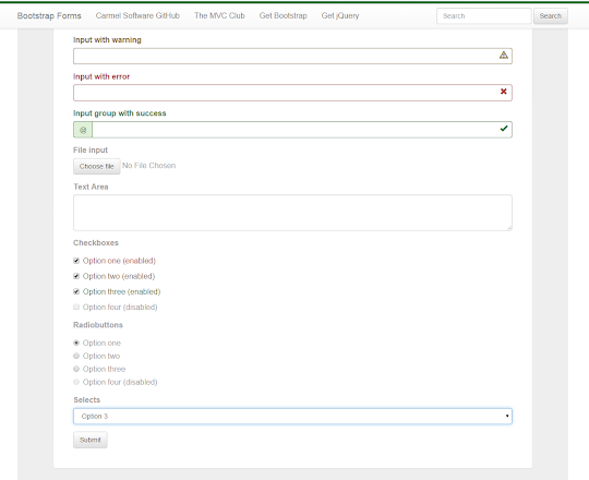
In this short Bootstrap tutorial for Beginners we exemplify the implementation of responsive Forms, including checkboxes, radiobuttons, select lists,file input,textareas, and more... , for use on desktop computers and also on all kind of Mobile devices screens , such as iPhones, iPads, small screens PCs, Tablets , and more...This is how is displayed our example of using Bootstrap responsive Forms:

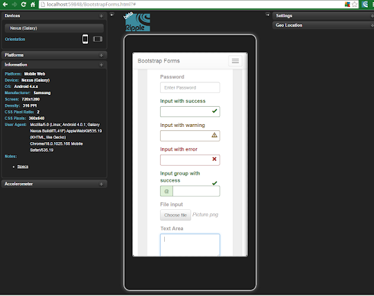
And this is how our Bootstrap Form looks in the Ripple Emulator :

Bootstrap Tutorial Lesson 5 - Responsive Forms
We'll be working with a Bootstrap template downloaded from www.initializr.com/ (this is explained in the following short Tutorial about Bootstrap Templates), and use a Mobile Emulator, as explained in this short tutorial on installing the FREE Ripple Emulator.
In case you began coding an HTML5 file from scratch, just add this references to the Head :
<script src="//code.jquery.com/jquery-1.11.3.min.js"></script>
<meta name="viewport" content="width=device-width, initial-scale=1">
<link rel="stylesheet" href="https://maxcdn.bootstrapcdn.com/bootstrap/3.3.4/css/bootstrap.min.css">
<link rel="stylesheet" href="https://maxcdn.bootstrapcdn.com/bootstrap/3.3.4/css/bootstrap-theme.min.css">
<script src="https://maxcdn.bootstrapcdn.com/bootstrap/3.3.4/js/bootstrap.min.js"></script>
And the scripts will be prep ended to the "Body" as follows:
<script src="//ajax.googleapis.com/ajax/libs/jquery/1.11.2/jquery.min.js"></script>
<script src="https://maxcdn.bootstrapcdn.com/bootstrap/3.3.4/js/bootstrap.min.js"></script>
You can download the complete app from the following GitHub repository:
https://github.com/CarmelSoftware/Bootstrap_Forms
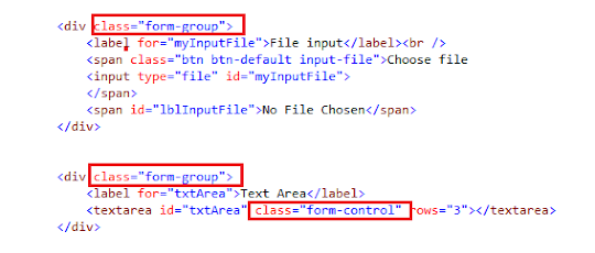
Now we add a Textarea and an input of type "file":

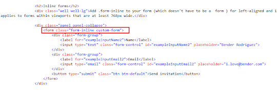
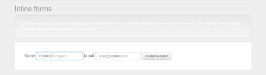
Now we'll add an Inline Form. Add a class .form-inline to your form, to get a left-aligned and also an inline-block controls Form, that will apply to devices bigger than 768px wide :


Inline Forms:
Horizontal Forms:
https://github.com/CarmelSoftware/Bootstrap_Forms
Now let's add the body contents, and start coding .
1) Bootstrap Form with all supported input elements:
The Bootstrap forms controls automatically get a global styling, and therefore all textual input , textareas , and select lists decorated with the .form-control class , are set to width 100% .
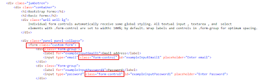
First step is create the Form as follows:

As you see, we wrap both labels and controls in a class .form-group , to get optimum spacing.
The CSS3 code for the .custom-form class is this:
.custom-form {
color:#a8a3a3;
padding: 35px;
}
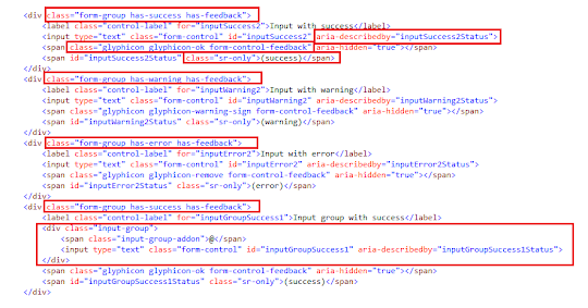
Then, we use the following "success-warning-error" display together with its correspondent Glyphicons:

Also we added an .input-group to use an add-on and to merge the input element with a "@" .

Finally we add checkboxes, marking some of them as "warning" or "error", and disabling one:

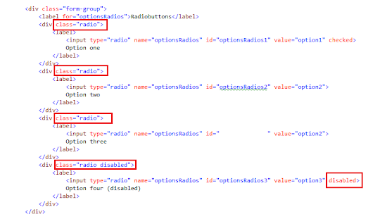
Also we add some radiobuttons:

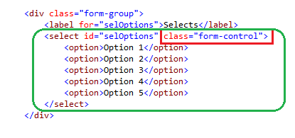
Now we add a select list:

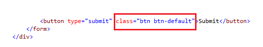
Finally we append a Submit button:

2) Inline forms:
Now we'll add an Inline Form. Add a class .form-inline to your form, to get a left-aligned and also an inline-block controls Form, that will apply to devices bigger than 768px wide :

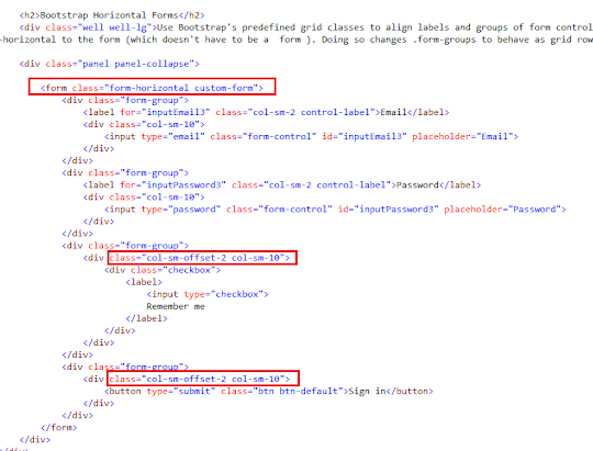
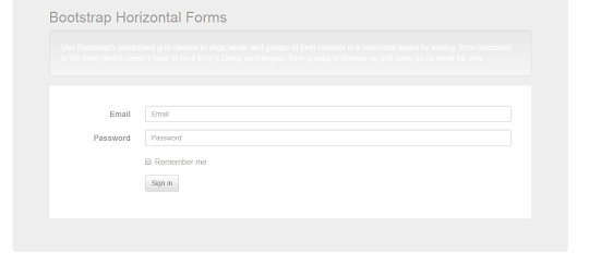
3) Bootstrap Horizontal Forms:
Another type of useful responsive Form, is the Horizontal Form. We use several Bootstrap's grid classes to align the groups of controls , by using the class .form-horizontal . This causes the groups to be set as grid rows :

That's all. Our Forms will be displayed this way:
1- In Mobile devices :
The display for Nexus Galaxy devices is as follows:


2- Medium & larger desktops:

Inline Forms:

Horizontal Forms:

by Carmel Schvartzman
כתב: כרמל שוורצמן