This is the Step by step Bootstrap Tutorial Lesson 1 - Grids and Responsive Layouts
In this Bootstrap tutorial for Beginners we exemplify the use of Grids , for use on all kind of screens Mobile devices :iPhone, iPad, Tablets, and desktops...Responsive layouts are part of the Mobile First and the apps Progressive Enhancement approaches.
Twitter Bootstrap defines a layout divided in twelve columns, which allows your app to be fully responsive on four classes of screens: phones, tablets, desktops, and larger desktops.


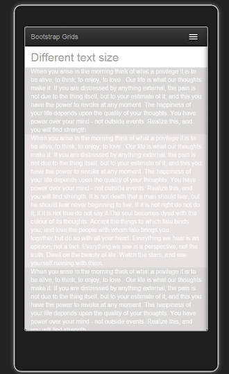
And this is how it looks in a Mobile Emulator, in Tablet display:

Bootstrap Tutorial Lesson 1 - Grids and Responsive Layouts
Since for this post we use the Bootstrap , which needs the jQuery Frameworks, enter getbootstrap.com and the jQuery web site , to get the latest versions of the files on CDN . Because we will also be using a Mobile Emulator, please refer to this tutorial on installing the Ripple Emulator.
<script src="//code.jquery.com/jquery-1.11.3.min.js"></script>
<meta name="viewport" content="width=device-width, initial-scale=1">
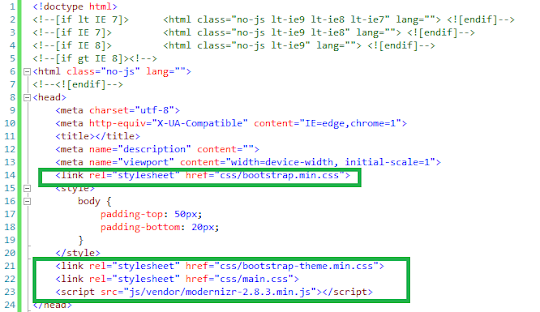
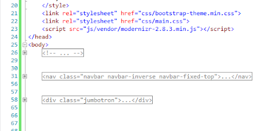
Else, if you're working with a Bootstrap template as we explained in the previous Tutorial, just leave the Head as it is, just erase the body contents after the "Jumbotron" div, so that we will have a nice NavBar and a jumbotron:

where "X" is the number of sizes that are to be sum up to 12:
Notice that we stipulated that for small devices (tablets), the spread will be col-md-3 three times: that will no sum 12 , and that's why the snapshot for tablets shows that the columns do not fill the screen.
Make some experiments to see what changes.
What will happen if we have different quantities of text , but we want to get a graceful display?
We set the width of the bigger column on the Bootstrap Grid , giving it more cols as follows:
In the case that you want to order the columns when they do not fill the width of the screen, you should use OFFSET:
By setting " col-lg-offset-4 " you leave 4 columns free, and place your column in the 5th place:
by Carmel Schvartzman
<link rel="stylesheet" href="https://maxcdn.bootstrapcdn.com/bootstrap/3.3.4/css/bootstrap.min.css">
<link rel="stylesheet" href="https://maxcdn.bootstrapcdn.com/bootstrap/3.3.4/css/bootstrap-theme.min.css">
<script src="https://maxcdn.bootstrapcdn.com/bootstrap/3.3.4/js/bootstrap.min.js"></script>
Else, if you're working with a Bootstrap template as we explained in the previous Tutorial, just leave the Head as it is, just erase the body contents after the "Jumbotron" div, so that we will have a nice NavBar and a jumbotron:


The next thing to do is to append a <div> with the Bootstrap class "container", to wrap all our markup.
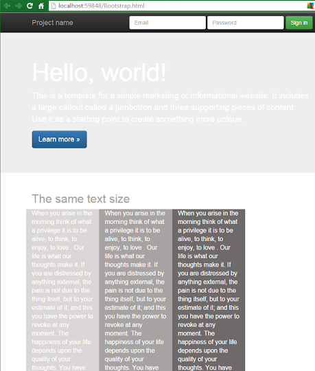
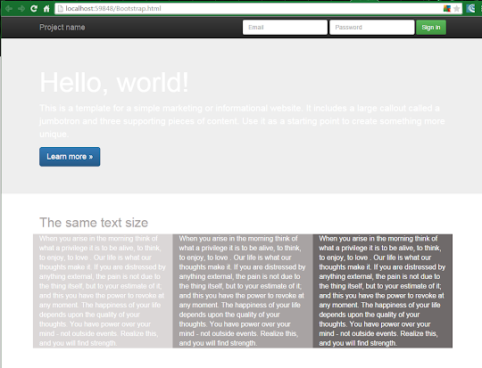
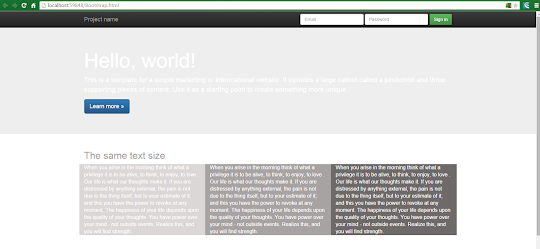
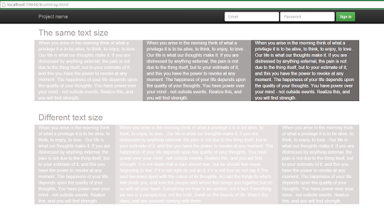
1) Columns with the same volume of content:
In this simple case, we want to display 3 columns with approx the same quantity of content, in such a way that it is equally shown in all kind of devices:
In phones is displayed this way:
In tablets :

In medium desktops:

In larger desktops:
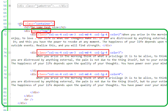
As it stands to reason , each column belongs to a "row", so we type a <div> with a class="row", and,
inside it, we put 3 <div> with special classes according to the 4 sizes of screen recognized by Bootstrap: 1-phones 2-tablets 3-medium desktops 4-larger desktops
So if you remember as we said before, the layout is thought as divided in 12 columns, we set the width of each one as spread on 3 units: 3 + 3 + 3 = 12
In all 4 cases:
1-phones : class="col-xs-X"
2-tablets : class="col-sm-X"
3-medium desktops: class="col-md-X"
4-larger desktops: class="col-lg-X"

Notice that we stipulated that for small devices (tablets), the spread will be col-md-3 three times: that will no sum 12 , and that's why the snapshot for tablets shows that the columns do not fill the screen.
Make some experiments to see what changes.
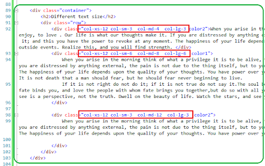
2) Columns with different amounts of content:
What will happen if we have different quantities of text , but we want to get a graceful display?
We set the width of the bigger column on the Bootstrap Grid , giving it more cols as follows:
1-phones : class="col-xs-12" : this will force every column to spread over the entire width...
2-tablets : class="col-sm-6" : this will give to the bigger column one half of the width
3-medium desktops: class="col-md-8" : this will give it 2/3 width
4-larger desktops: class="col-lg-6" : this to give 1/2 width

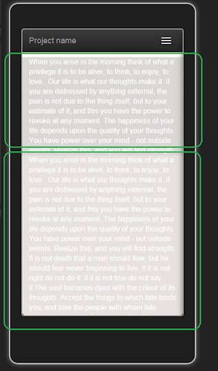
In phones this will be displayed this way:

In tablets :
In larger desktops:

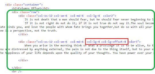
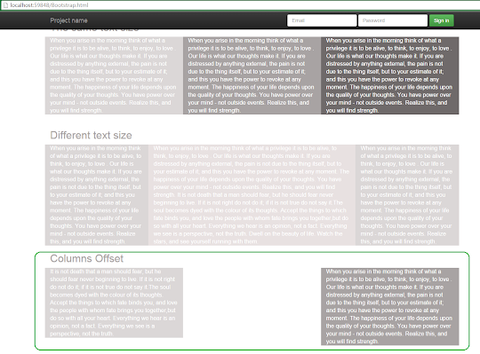
3) Columns offset:
By setting " col-lg-offset-4 " you leave 4 columns free, and place your column in the 5th place:


by Carmel Schvartzman
כתב: כרמל שוורצמן
No comments:
Post a Comment