In this Step by step Bootstrap Tutorial Lesson 11 - Responsive Tables
we experiment with several kinds of responsive tables, Condensed, Bordered, Hover, Striped , and more, shown in different formats, by building an Application for Mobile & desktop computers . This App will display the Bootstrap Tables in all screen sizes .You can download the complete app from the following GitHub repository:
https://github.com/CarmelSoftware/jQueryPlugin_BootstrapTable
This is how this is displayed:

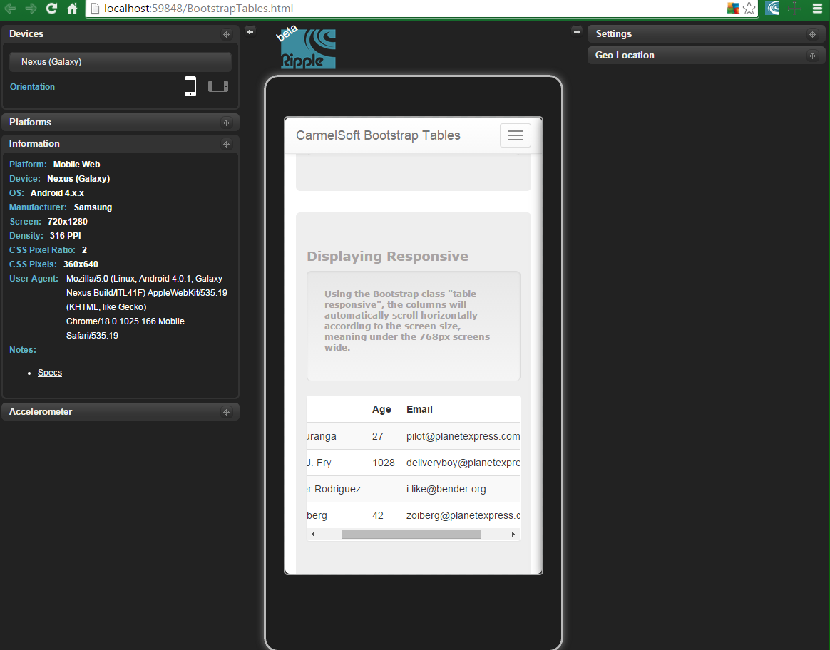
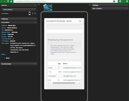
And this is the way how it looks in an Emulator , for Nexus Galaxy devices:
Bootstrap Tutorial Lesson 11 - Responsive Tables
You can start this app by using a free Bootstrap template from www.initializr.com/ (explained in this short post : Bootstrap Templates), or you can write the following jQuery and Bootstrap links in the HTML5 file's Head:
<meta name="viewport" content="width=device-width, initial-scale=1">
Also put the following references before closing the </body> element:
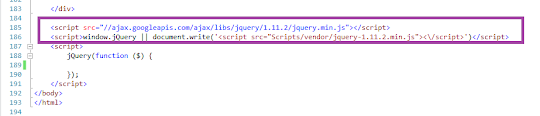
<script src="//ajax.googleapis.com/ajax/libs/jquery/1.11.2/jquery.min.js"></script>
<script src="https://maxcdn.bootstrapcdn.com/bootstrap/3.3.4/js/bootstrap.min.js"></script>

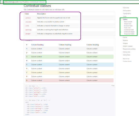
The Bootstrap allows to enable the contextual helper classes such as warning, danger , etc, which is written this way :


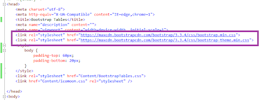
<link rel="stylesheet" href="https://maxcdn.bootstrapcdn.com/bootstrap/3.3.4/css/bootstrap.min.css">
<link rel="stylesheet" href="https://maxcdn.bootstrapcdn.com/bootstrap/3.3.4/css/bootstrap-theme.min.css">

<script src="//ajax.googleapis.com/ajax/libs/jquery/1.11.2/jquery.min.js"></script>
<script src="https://maxcdn.bootstrapcdn.com/bootstrap/3.3.4/js/bootstrap.min.js"></script>

To setup a Mobile Emulator, read this short tutorial on installing the FREE Ripple Emulator.
1) Using Bootstrap Responsive Tables in a responsive Web Page:
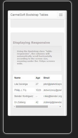
The Bootstrap supports elegant tables that you can display in several ways. Because the problems planted by small screens, Bootstrap allows you to add scrolling to tables when displayed in them. Using the Bootstrap class "table-responsive", the columns will automatically scroll horizontally according to the screen size, meaning , under the 768px screens wide , tables will be responsive:

Also, we achieve a hover striped table by using these classes.
All the Bootstrap Tables documentation can be found in the GetBootstrap Web Site.
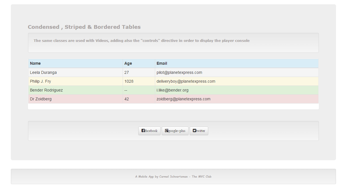
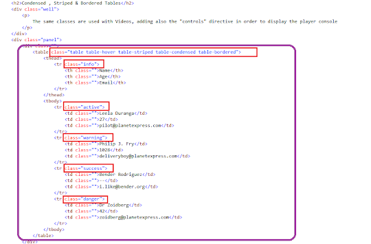
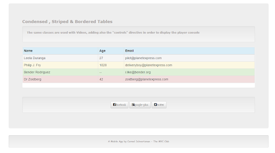
2) Using Bordered Condensed Tables in a Responsive Bootstrap Web Page:
The difference between this kind of tables and the others reside in a "condensed" padding style, and the borders that these classes define:
The Bootstrap allows to enable the contextual helper classes such as warning, danger , etc, which is written this way :

This is the style added for the App:
body {
padding-top: 60px;
padding-bottom: 20px;
}
.jumbotron h1 {
color: #a8a3a3;
}
h2 {
font: 900 18px Verdana;
color: #a8a3a3;
}
.well p{
font: 700 12px Verdana !important;
color: #a8a3a3;
}
.well-footer, .well-footer a {
font: 900 10px Comic Sans MS;
color: #a8a3a3;
}
.alert {
font: 600 9px Verdana;
}
.centered {
text-align: center;
}
That's all. Our Tables will be displayed this way:
1- In Mobile devices :


The displays for Nexus devices screens is as follows:
2- On Medium and Big desktops:

by Carmel Schvartzman
כתב: כרמל שוורצמן
No comments:
Post a Comment