In this Step by step Bootstrap Tutorial Lesson 13 - Responsive MegaNavbars
post, we design in 15 minutes a responsive Bootstrap MegaNavbar with several kinds of components like Tables, Lists, buttons, Carousel, Search form, and more, shown in different formats, in a from-scratch Application for Mobile & desktop computers . All the code is open source at GitHub:https://github.com/CarmelSoftware/Bootstrap_MegaNavbars
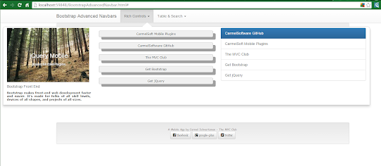
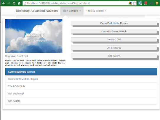
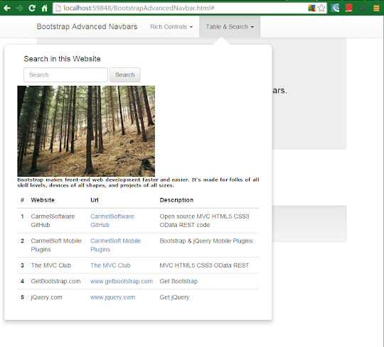
This is how the MegaNavbars are displayed:


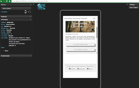
And this is the App in Nexus Galaxy devices :

Bootstrap Tutorial Lesson 13 - Responsive MegaNavbars
https://github.com/CarmelSoftware/Bootstrap_MegaNavbars
You can start building from a free Bootstrap template from www.initializr.com/ (as explained in this short tutorial: Bootstrap Templates). Elsewhere add to your HTML5 page the following jQuery and Bootstrap references :
<meta name="viewport" content="width=device-width, initial-scale=1">
...and the following scripts before closing the </body> element :
<script src="//ajax.googleapis.com/ajax/libs/jquery/1.11.2/jquery.min.js"></script>
<script src="https://maxcdn.bootstrapcdn.com/bootstrap/3.3.4/js/bootstrap.min.js"></script>
<header class="navbar navbar-default navbar-fixed-top" role="navigation">
<div class="container">
<div class="navbar-header">
<button type="button" class="navbar-toggle collapsed"
data-toggle="collapse" data-target=".my-navbar-collapse"
aria-expanded="false" aria-controls="navbar">
<span class="sr-only">Toggle navigation</span>
<span class="icon-bar"></span>
<span class="icon-bar"></span>
<span class="icon-bar"></span>
</button>
<a class="navbar-brand" href="#">Bootstrap Advanced Navbars</a>
</div>
The button will open the collapsible "navbar-collapse collapse" . Inside it, the navbar-bar will include the following button to open a dropdown-menu:
<ul class="nav navbar-nav">
<li class="dropdown custom-dropdown">
<a class="dropdown-toggle" data-toggle="dropdown" href="#">Rich Controls <span class="caret"></span></a>
<ul class="dropdown-menu custom-dropdown-menu1 row">
<ul class="nav navbar-nav">
<li class="dropdown custom-dropdown">
<a class="dropdown-toggle" data-toggle="dropdown" href="#">Table & Search <span class="caret"></span></a>
<ul class="dropdown-menu custom-dropdown-menu2 row">
Inside it, add the Search Form:
<li class="col-xs-12 col-sm-12 col-lg-4">
<form class="navbar-form" role="form">
<h4>Search in this Website</h4>
<div class="form-group">
<input type="text" placeholder="Search" class="form-control" />
</div>
<button type="submit" class="btn btn-default">Search</button>
</form>
<img src="http://www.stockvault.net/data/2011/02/23/118137/small.jpg" alt="..." />
<p class="nav-text">
Bootstrap makes front-end web development faster and easier.
It's made for folks of all skill levels, devices of all shapes, and projects of all sizes.
</p>
</li>
We enhanced this column with an image and some text.
Now for the Table:
<li class="col-xs-12 col-sm-12 col-lg-8">
<table class="table table-hover">
<thead>
<tr>
<th>#</th>
<th>Website</th>
<th>Url</th>
<th>Description</th>
</tr>
</thead>
<tbody>
<tr>
<th scope="row">1</th>
<td>CarmelSoftware GitHub</td>
<td><a href="https://github.com/CarmelSoftware" >CarmelSoftware GitHub
</a>
</td>
<td>Open source MVC HTML5 CSS3 OData REST code</td>
</tr>
<tr>
<th scope="row">2</th>
<td>CarmelSoft Mobile Plugins</td>
<td><a href="http://carmelsoft.blogspot.com" >CarmelSoft Mobile Plugins</a></td>
<td>Bootstrap & jQuery Mobile Plugins</td>
</tr>
<tr>
<th scope="row">3</th>
<td>The MVC Club</td>
<td><a href="http://themvcclub.blogspot.com" >The MVC Club</a></td>
<td>MVC HTML5 CSS3 OData REST</td>
</tr>
<tr>
<th scope="row">4</th>
<td>GetBootstrap.com</td>
<td><a href="http://www.getbootstrap.com" >www.getbootstrap.com</a></td>
<td>Get Bootstrap</td>
</tr>
<tr>
<th scope="row">5</th>
<td>jQuery.com</td>
<td><a href="http://www.jquery.com" >www.jquery.com</a></td>
<td>Get jQuery</td>
</tr>
</tbody>
</table>
</li>
</ul>
</li>
</ul>
</nav>
</div>
</header>
That's all. The entire MegaNavbar will be shown like this:

<link rel="stylesheet" href="https://maxcdn.bootstrapcdn.com/bootstrap/3.3.4/css/bootstrap.min.css">
<link rel="stylesheet" href="https://maxcdn.bootstrapcdn.com/bootstrap/3.3.4/css/bootstrap-theme.min.css">
<script src="//ajax.googleapis.com/ajax/libs/jquery/1.11.2/jquery.min.js"></script>
<script src="https://maxcdn.bootstrapcdn.com/bootstrap/3.3.4/js/bootstrap.min.js"></script>
If you need a Mobile device Emulator, read this short tutorial on installing the FREE Ripple Emulator.
1) Designing a first MegaNavbar collapsible Menu:
Following, we give you all the code to create the MegaNavbar: all this code you just copy-paste inside your page, chaining the code IN GREEN , chunk after chunk, then customizing it to your needs.
Let's start.
We begin by creating the containing Navbar . We do so by using the Bootstrap classes "navbar navbar-default navbar-fixed-top" and "navbar-header" , in order to set the classic Mobile menu button:
<div class="container">
<div class="navbar-header">
<button type="button" class="navbar-toggle collapsed"
data-toggle="collapse" data-target=".my-navbar-collapse"
aria-expanded="false" aria-controls="navbar">
<span class="sr-only">Toggle navigation</span>
<span class="icon-bar"></span>
<span class="icon-bar"></span>
<span class="icon-bar"></span>
</button>
<a class="navbar-brand" href="#">Bootstrap Advanced Navbars</a>
</div>
The button will open the collapsible "navbar-collapse collapse" . Inside it, the navbar-bar will include the following button to open a dropdown-menu:
<li class="dropdown custom-dropdown">
<a class="dropdown-toggle" data-toggle="dropdown" href="#">Rich Controls <span class="caret"></span></a>
<ul class="dropdown-menu custom-dropdown-menu1 row">
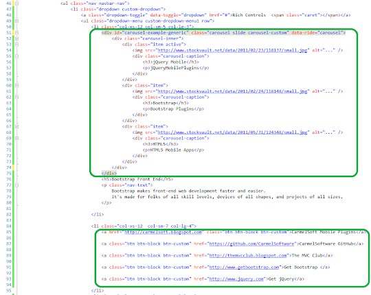
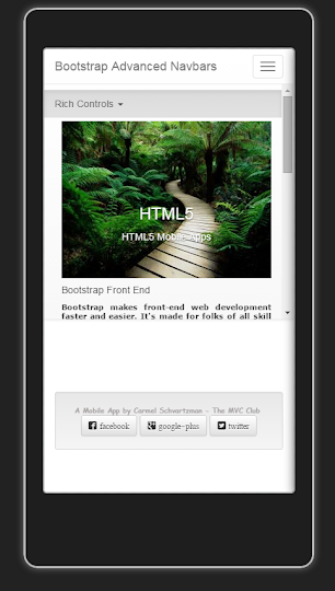
a ) Carousel:
Inside the menu, we first create a Carousel as follows:
<li class="col-xs-12 col-sm-5 col-lg-3">
<div id="carousel-example-generic" class="carousel slide carousel-custom" data-ride="carousel">
<div class="carousel-inner">
<div class="item active">
<img src="http://www.stockvault.net/data/2011/02/23/118137/small.jpg" alt="..." />
<div class="carousel-caption">
<h3>jQuery Mobile</h3>
<p>jQueryMobilePlugins</p>
</div>
</div>
<div class="item">
<img src="http://www.stockvault.net/data/2011/02/24/118148/small.jpg" alt="..." />
<div class="carousel-caption">
<h3>Bootstrap</h3>
<p>Bootstrap Plugins</p>
</div>
</div>
<div class="item">
<img src="http://www.stockvault.net/data/2011/05/31/124348/small.jpg" alt="..." />
<div class="carousel-caption">
<h3>HTML5</h3>
<p>HTML5 Mobile Apps</p>
</div>
</div>
</div>
</div>
<h5>Bootstrap Front End</h5>
<p class="nav-text">
Bootstrap makes front-end web development faster and easier.
It's made for folks of all skill levels, devices of all shapes, and projects of all sizes.
</p>
</li>
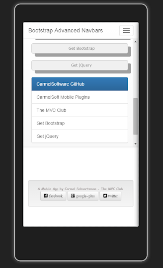
b ) Buttons:
Now we add link buttons:
<li class="col-xs-12 col-sm-7 col-lg-4">
<a href="http://carmelsoft.blogspot.com" class="btn btn-block btn-custom">CarmelSoft Mobile Plugins</a>
<a class="btn btn-block btn-custom" href="https://github.com/CarmelSoftware">CarmelSoftware GitHub</a>
<a class="btn btn-block btn-custom" href="http://themvcclub.blogspot.com">The MVC Club</a>
<a class="btn btn-block btn-custom" href="http://www.getbootstrap.com">Get Bootstrap </a>
<a class="btn btn-block btn-custom" href="http://www.jquery.com">Get jQuery</a>
</li>
c ) List :
We also add to the MegaNavbar a list group:
<li class="col-xs-12 col-sm-12 col-lg-5">
<div class="list-group">
<a href="https://github.com/CarmelSoftware" class="list-group-item active">CarmelSoftware GitHub
</a><a href="http://carmelsoft.blogspot.com" class="list-group-item">CarmelSoft Mobile Plugins</a>
<a href="http://themvcclub.blogspot.com" class="list-group-item">The MVC Club</a>
<a href="http://www.getbootstrap.com" class="list-group-item">Get Bootstrap</a>
<a href="http://www.jquery.com" class="list-group-item">Get jQuery</a>
</div>
</li>
</ul>
</li>
</ul>
That's all. The first Menu is done. Just add the CSS3 style (at the end of this post) to display it correctly:


All the Bootstrap Navbar documentation can be found in the GetBootstrap Web Site.
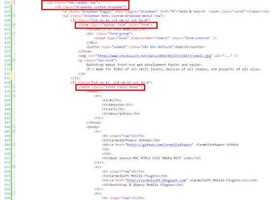
2) Designing a second MegaNavbar dropdown Menu:
Next, we create another Navbar menu, containing a Table and a Form. Add the following menu:<ul class="nav navbar-nav">
<li class="dropdown custom-dropdown">
<a class="dropdown-toggle" data-toggle="dropdown" href="#">Table & Search <span class="caret"></span></a>
<ul class="dropdown-menu custom-dropdown-menu2 row">
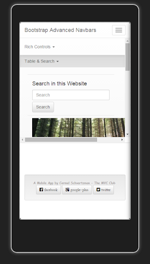
Inside it, add the Search Form:
<li class="col-xs-12 col-sm-12 col-lg-4">
<form class="navbar-form" role="form">
<h4>Search in this Website</h4>
<div class="form-group">
<input type="text" placeholder="Search" class="form-control" />
</div>
<button type="submit" class="btn btn-default">Search</button>
</form>
<img src="http://www.stockvault.net/data/2011/02/23/118137/small.jpg" alt="..." />
<p class="nav-text">
Bootstrap makes front-end web development faster and easier.
It's made for folks of all skill levels, devices of all shapes, and projects of all sizes.
</p>
</li>
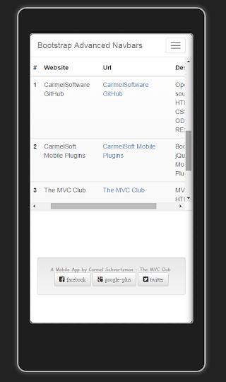
Now for the Table:
<li class="col-xs-12 col-sm-12 col-lg-8">
<table class="table table-hover">
<thead>
<tr>
<th>#</th>
<th>Website</th>
<th>Url</th>
<th>Description</th>
</tr>
</thead>
<tbody>
<tr>
<th scope="row">1</th>
<td>CarmelSoftware GitHub</td>
<td><a href="https://github.com/CarmelSoftware" >CarmelSoftware GitHub
</a>
</td>
<td>Open source MVC HTML5 CSS3 OData REST code</td>
</tr>
<tr>
<th scope="row">2</th>
<td>CarmelSoft Mobile Plugins</td>
<td><a href="http://carmelsoft.blogspot.com" >CarmelSoft Mobile Plugins</a></td>
<td>Bootstrap & jQuery Mobile Plugins</td>
</tr>
<tr>
<th scope="row">3</th>
<td>The MVC Club</td>
<td><a href="http://themvcclub.blogspot.com" >The MVC Club</a></td>
<td>MVC HTML5 CSS3 OData REST</td>
</tr>
<tr>
<th scope="row">4</th>
<td>GetBootstrap.com</td>
<td><a href="http://www.getbootstrap.com" >www.getbootstrap.com</a></td>
<td>Get Bootstrap</td>
</tr>
<tr>
<th scope="row">5</th>
<td>jQuery.com</td>
<td><a href="http://www.jquery.com" >www.jquery.com</a></td>
<td>Get jQuery</td>
</tr>
</tbody>
</table>
</li>
</ul>
</li>
</ul>
</nav>
</div>
</header>

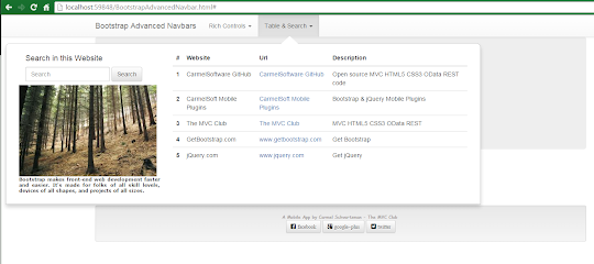
That's all. The entire MegaNavbar will be shown like this:
1- In Mobile devices :


2- On Medium and Big desktops:

This is the style for the App:
body {
padding-top: 50px;
padding-bottom: 20px;
}
.jumbotron h1 {
font: 900 25px Verdana;
color: #a8a3a3;
}
h2 {
font: 900 18px Verdana;
color: #a8a3a3;
}
.well {
font: 900 12px Comic Sans MS;
color: #a8a3a3;
}
.well-footer, .well-footer a {
margin-top:130px;
font: 900 10px Comic Sans MS;
color: #a8a3a3;
}
.alert {
font: 600 9px Verdana;
}
.centered {
text-align: center;
}
.navbar-nav > li > .dropdown-menu {
margin-top: 15px;margin-left:10px;
border-top-left-radius: 10px;
border-top-right-radius: 10px;
border-bottom-left-radius: 0px;
border-bottom-right-radius: 0px;
}
.custom-dropdown {
position: static !important;
width: 100%;
}
.nav-text {
text-align: justify;
font: 800 11px verdana;
}
.btn-custom {
font: 900 12px verdana;
text-shadow: -1px -1px 0px #fff;
background-color: #f0f0f0;
margin: 11px 21px 21px 0px;
padding: 20px;
border: 1px solid #c0c0c0;
border-radius: 5px;
box-shadow: 10px 10px #a0a0a0;
}
.custom-dropdown-menu1:before {
border-bottom: 15px solid #fff;
border-right: 17px solid transparent;
border-left: 17px solid transparent;
position: absolute;
top: -15px;
left: 38%;
z-index: 10;
}
.custom-dropdown-menu1:after {
border-bottom: 17px solid #FFF;
border-right: 19px solid transparent;
border-left: 19px solid transparent;
position: absolute;
top: -15px;
left: 38%;
z-index: 8;
}
.custom-dropdown-menu2 {
margin: 20px;
padding: 15px 15px;
width: 70%;
box-shadow: 2px;
}
.custom-dropdown-menu2:before {
border-bottom: 15px solid #fff;
border-right: 17px solid transparent;
border-left: 17px solid transparent;
position: absolute;
top: -15px;
left: 58%;
z-index: 10;
}
.custom-dropdown-menu2:after {
border-bottom: 17px solid #fff;
border-right: 19px solid transparent;
border-left: 19px solid transparent;
position: absolute;
top: -17px;
left: 58%;
z-index: 8;
}
by Carmel Schvartzman
כתב: כרמל שוורצמן


